The page transitions are smoother than those of a typical site, thanks to well-timed fades that seamlessly guide users from one page to the next.
Land of Plenty
Modern portfolio for a strategic branding agency
- In collaboration with
- Land of Plenty

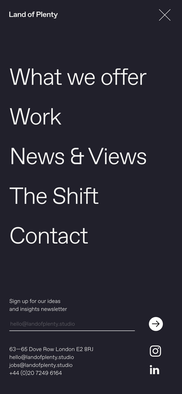
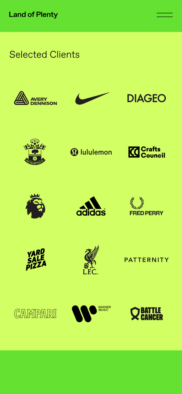
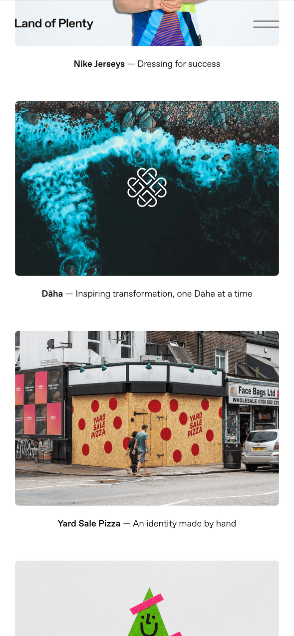
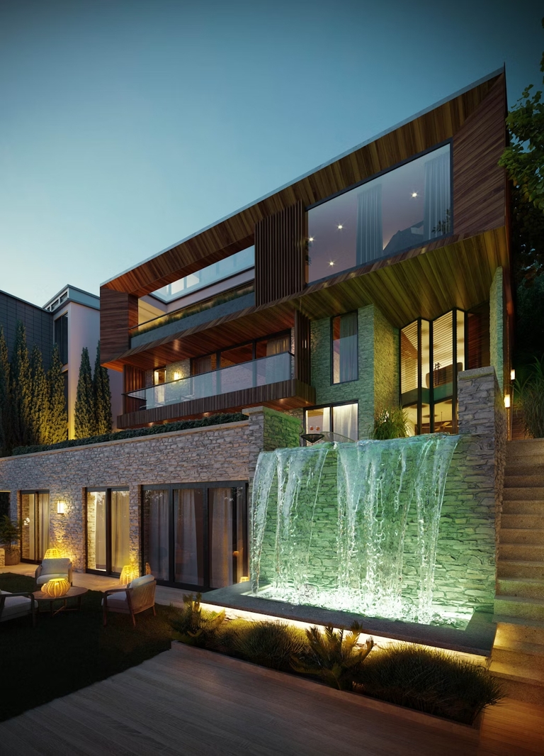
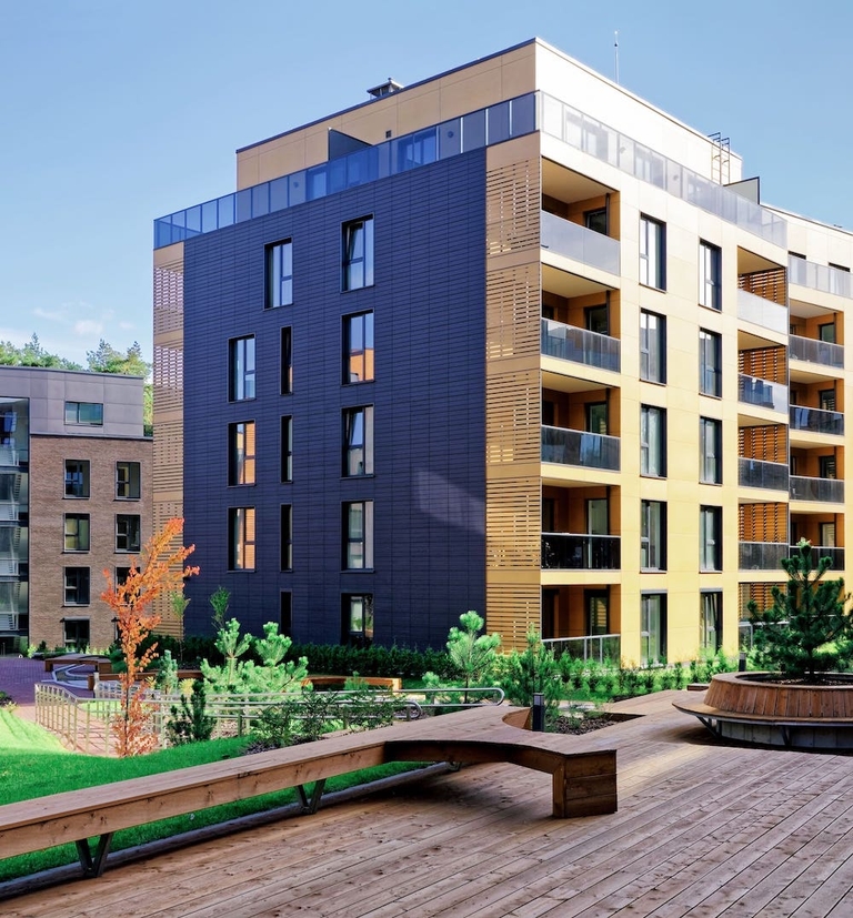
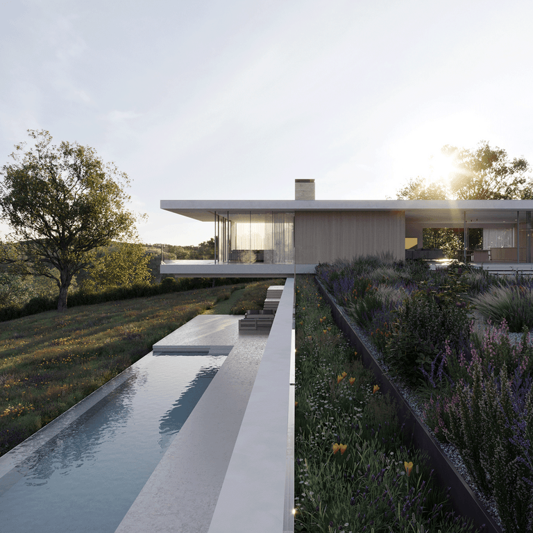
London-based design agency Land of Plenty asked us to develop their new website, featuring animated and interactive elements, rich use of colour and a filterable work section to house their impressive portfolio.
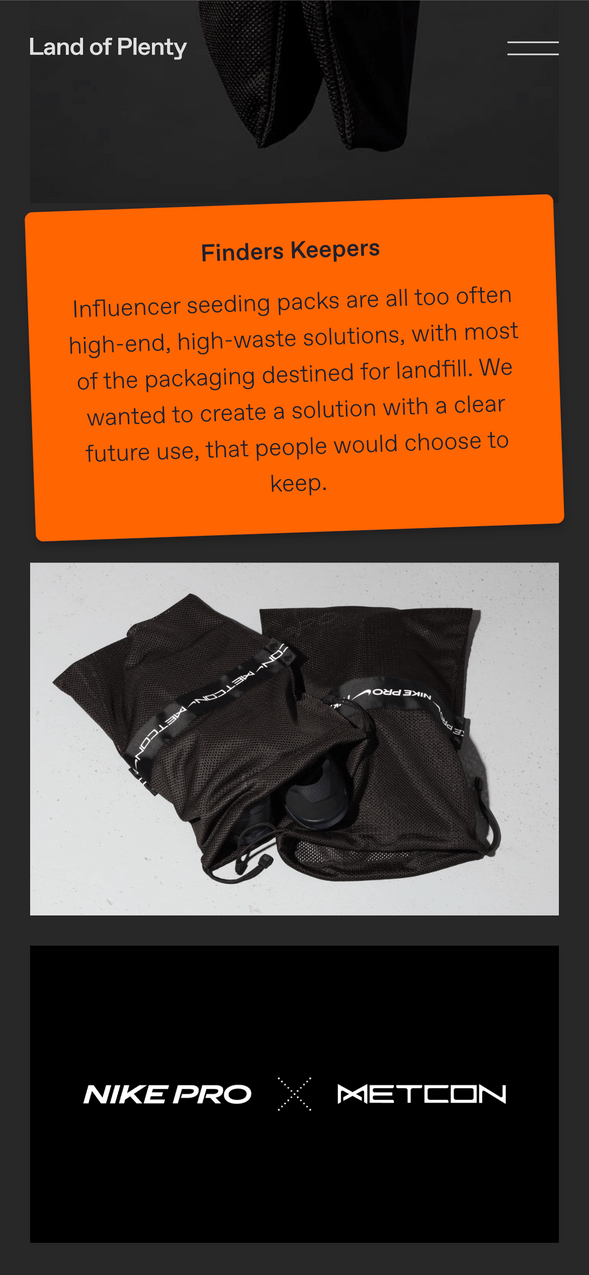
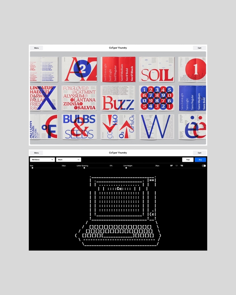
The client needed flexibility in the creation of case study pages. To accommodate this, we developed several adaptable content blocks that could be arranged in any sequence and presented in various visual styles.


Although built with a traditional WordPress backend, the website is elegant and enhanced by subtle animations and interactive elements throughout.
We built a custom front-end editor to allow the design team to manually position the layout of project thumbnails on the work page.
As with many of our design agency collaborations, this was the first of several projects we’ve been working on with Land of Plenty since we began working together.
Client
Land of Plenty
Date(s)
Spring 2024
Back to Our Work
Services and Tech
- Front-end Development
- WordPress CMS

